marți, 31 martie 2015

A simple cement sheet box with elements which create shading devices and privacy screens


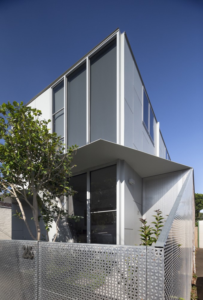
The site is a small 300m2 suburban block in south east Melbourne. The brief was to design a new dwelling to accommodate a family of 4 while also including flexible spaces which can change as the children grow and the needs change. A collection of bikes also needed to be accommodated internally and externally as these are a major form of transport for the family. The budget was very tight so the building areas were kept as compact as possible, and simple cost effective materials used throughout. A 2 storey structure was designed to minimise the building footprint and maximise the amount of garden space. The strategy was to design a simple cement sheet box with elements which folded out of it to create shading devices and privacy screens where required. The fence unravels itself from the building, folding down from the entry canopy onto the street then winding around to conceal the bin enclosure. Triangular perforations in the fence aim to deter the local graffiti artists as well as allowing light to penetrate. This material is also used as a privacy screen on the 1st floor to prevent overlooking into neighbours’ properties. In contrast the southern recycled brick wall offers itself as a canvas for the local graffiti artists which reside in the area. Internally it is left exposed internally and is used to store a series of racing bikes.


Info and images © FMD Architects


A simple cement sheet box with elements which create shading devices and privacy screens

A house divided in two buildings, separated by a central courtyard and reconnected by a glazed link


The strategy was to divide the house into two discreet buildings, old and new, separated by a large central courtyard and reconnected by a glazed link. The courtyard with its pool, gives the new building its northern aspect and is conceived as an extension of the communal spaces of the home which surround it on three sides. It also bestows the old building a formal autonomy. The original building fabric was stripped back to its salvageable elements and the footprint reduced to form a seemingly freestanding cottage at the front of the site. The exterior was then carefully restored to its original Victorian character. Internally spaces of the old house were reconfigured to become an office, library/living room and guest bedroom. The volume of the original structure was exploited in the new layout to create a grand living space. A new two storey timber clad building was constructed at the rear of the property facing the old cottage across the courtyard and pool. Its angular form, commenced as a response to planning constraints, evolved into a subtle geometry that shaped the envelope and influenced the plan of both buildings.


Info and images © Coy Yiontis Architects


A house divided in two buildings, separated by a central courtyard and reconnected by a glazed link

luni, 30 martie 2015

Under an oversized canopy, a sliced open volume turns the inside out at the new Miu Miu Tokyo


The new Miu Miu in Tokyo by Herzog & de Meuron is a box placed directly at the level of the street, its cover slightly open to mark the entrance and allow pedestrians to look inside. Only then do they realize that the building is a shop. Here, under the oversized canopy, the two-storey interior is visible at a single glance, as if the volume had been sliced open with a big knife, turning the inside out. The rounded, soft edges of the copper surfaces inside meet with the razor-sharp steel corners on the outside of the metal box, while the cave-like niches clad in brocade face the central space of the shop like loges in a theatre. The shop on two tall storeys not only presents enticing goods on tables and in display cases; it is also like a spacious and comfortable home with inviting sofas and armchairs. The façade has neither logo nor pomp; it is a polished, mirror-smooth surface, as if one single giant brushstroke had swept smooth the ordinarily matte surface of the steel panelled façade. This surface attracts the gaze and curiosity of passing pedestrians. But instead of affording a view inside, as in a shop window, the gaze is inverted; instead of the anticipated see-through window, viewers encounter self-reflection. While the street is not a place that encourages lingering and looking around, the building itself is a gesture that extends an invitation to come inside and stay a while.


Info and images © Herzog & de Meuron


Under an oversized canopy, a sliced open volume turns the inside out at the new Miu Miu Tokyo

The Vicious cycle is hand-built using original MacIntyre frames, Dekker Tri-spoke wheels & select contemporary components


The Vicious Cycle is a collaboration between retired frame-builder Duncan MacIntyre and composite specialist Anton Dekker. MacIntyre is South Africa’s most accomplished bicycle frame builder having built frames from the early 1970’s under a wide range of local brands and later custom frames for competitive use under his own brand ‘Gemini’. Dekker runs a specialist composite workshop producing bespoke components for brands such as Porsche, Lamborghini and Ferrari. The Vicious cycle is available in an edition of 10, hand-built using original MacIntyre frames, Dekker Tri-spoke wheels & select contemporary components.


Info and images © Dutchmann


The Vicious cycle is hand-built using original MacIntyre frames, Dekker Tri-spoke wheels & select contemporary components

vineri, 27 martie 2015

Apparatus Studio is a showroom, gathering point and creative laboratory


The Apparatus Studio showcases lighting and objects collections among a mix of furnishings and art. Located in Manhattan, the space serves as a gathering point for clients and designers as well as a creative laboratory.


Images ©  for AD Spain


Apparatus Studio is a showroom, gathering point and creative laboratory

A wood skin crosses transversally the home of two book lovers in Barcelona


A skin made of wood that transversally crosses the housing is Susanna Cots‘ “leitmotiv” to develop this interior design project, the home in Barcelona of two book lovers. On the same floor, the main artery that unites the whole space is a wooden lacquered sheet that crosses the rooms and wraps them up like a warm and protective skin. Wood crosses the apartment vertically and horizontally creating an emotional and warm passageway. The starting point of the housing is located in its central nucleus where the dining room’s ceilings are dressed in wood that, at the same time, shapes the furniture that holds the TV and a bioethanol fireplace. This wooden wrapping continues across the ceiling and separates the living and the water areas inside and outside, and is subtly bathed in natural light in the bathrooms. The warm area reaches the suite defining the sleeping area and finally becoming the bed head.


Info and images © Susanna Cots


A wood skin crosses transversally the home of two book lovers in Barcelona